|
|
Post by dreamslayer28 on Aug 11, 2017 7:57:58 GMT -5
So, it's been a few days since Patch 3.0.0 has been released on Android (depending on your timezone). With that being said, I just wanted to say some things about the new patch.
First of all, it's been as clear as day that Pixonic is aiming to make everything viable in terms of use. This is best exemplified in the way they buffed the default medium bots (Vityaz, et al.), the ECU shield and most importantly, the Zenit.
Secondly, it is still too early to know where the patch is actually taking this game, as it turns out that this patch is just the first part of a series of patches.
Finally, yes, some of us may not like the changes; some may want the "heavy" feel of a control mech game and are looking back towards the times when...things were a lot different. Yes, I don't believe that I'll understand any of these things (I am a new player who just got into the game in June 2017), but at the same time, there are others who believe that the changes in the game are actually paving the way for turning War Robots into a more accepted title worldwide (which will make Pix big, right?)
This is not to say that the points are not valid. Each one of us has his/her opinion; what falls upon us is to support these statements with facts/observations and at the same time respect the views of those who don't share our perspective.
Now, time to go to the points that I want to say.
What did I like about the patch?
1. Damage indicators are much clearer: In the past, it is hard for me to know whether I'm actually hitting something or estimate how much I should shoot. Thanks to the fading red bars, I can now accurately judge on the way that I should shoot an opponent, which leads to better matches and more enjoyable maps overall.
2.The game is responsive now. Less glitches, less hassles, less lag between the time I press my screen and the movement of my robot.
3. Better connection capability: While the game took 40-50 seconds to reconnect before, it is now a thing of the past as the reconnection time is decreased to 5-10 seconds, in case of lag. Also, the game is now playable DESPITE HIGH PING, which means that there should be more enjoyment of the game at the moment.
4. Beacon Rush: That's adrenaline for you. 'Nuff said.
5. Viability of weapons: At least in Gold, where I stand right now, people are not afraid to use different new styles of play. Someone even used a triple Zenit on a Fury - and it almost won us a game!
6. More variety: Though I don't have a Rhino just yet, I am happy to see more of them on the field, as it provides a much- needed break from the missile-lobbing and endless sniping that has dominated the patch before this one.
On what I did dislike:
1. Kill feed is at the bottom: Everyone who has studied creative writing, photo composition, etc. etc. at one point or another should know that the human brain will tend to read in a "Z" way; that is, from top left to top right, then to bottom left to bottom right. With the location of the new kill feed, it takes more effort for me to memorize the kind of drops that I faced before I was killed.
There is a reason why the kill feed is always placed on the top right of a screen in most games: It allows the user to keep track of their surroundings using the in-game radar and the feed with less requirement for micromanagement. Sure, some people appreciate the skill scaffolding that's happening here, but how about the new ones, old ones and the others who can't really micromanage?
Na-ah, Pix.
2. Clutter: While I am yet to experience a negative experience in-game due to the large names, I am aware of the opinion that the placement of the names actually distract players' aim.
Maybe just put an option to make names smaller or put them away altogether.
3. Maybe more soon. I don't think an hour of day of play a day is enough to actually dissect the effects of the patch...
Well, this is not related to the patch, but I keep on seeing 10/11 to 11/12 hangars with two Lancelots and a variety of other bots in my matches, ranging from High Gold to Middle Expert.
Oh well, Pixi. Matchmaking fix please next!!!
|
|
|
|
Post by shakingrabbit on Aug 11, 2017 8:16:48 GMT -5
Curious, do you play on a tablet, phone, maybe even PC?
|
|
|
|
Post by llama4president on Aug 11, 2017 9:01:24 GMT -5
Kudos, well written review.
Update us when you got more analysis on what we got on our hands.
|
|
☆ CORVUSNEX ☆
Destrier

Posts: 106
Karma: 76
Pilot name: ☆ CORVUSNEX ☆
Platform: Android
Clan: iΔC
League: Champion
Server Region: North America
Favorite robot: Galahad
|
Post by ☆ CORVUSNEX ☆ on Aug 11, 2017 9:23:08 GMT -5
Good review.
My opinions about this patch:
1. I like the Beacon Rush mode. Good adrenaline fix, matches are intense and short. That means more games/hour, which is really important for me.
2. I like how more things are viable, as stated above. Maybe not in Beacon Rush, where splash damage is king, but is regular Domination mode there are so many weapons and builds that are viable, if not good, right now.
3. I LOVE the responsiveness of the controls. Everything moves much better now!
4. I am ambivalent about the kill history being placed at the bottom of the screen. That list does provide useful info, but I find that it is not that important to my play. I go where my team needs me, and do the best with the bot I currently have. The kill log has little effect on that.
5. I do not like that fat red "X" that appears in my targeting reticle when I hit my target. Especially if there is another enemy bot next to my target it gets confusing as to what I am shooting at.
|
|
|
|
Post by dreamslayer28 on Aug 11, 2017 9:28:55 GMT -5
Curious, do you play on a tablet, phone, maybe even PC? All three, with the tablet and phone having the same account. PC (i.e. Bluestacks emulator) is rather inactive. |
|
|
|
Post by stokr on Aug 11, 2017 9:34:20 GMT -5
4. I am ambivalent about the kill history being placed at the bottom of the screen. That list does provide useful info, but I find that it is not that important to my play. I go where my team needs me, and do the best with the bot I currently have. The kill log has little effect on that.5. I do not like that fat red "X" that appears in my targeting reticle when I hit my target. Especially if there is another enemy bot next to my target it gets confusing as to what I am shooting at. I'm happy the kill history was moved. I'd be happy if they removed it all together from the UI and made it an accessible log at the end of a match for review. It serves no purpose for me during a match and I'm glad to have the visual space back. I prefer the red X. Easier for me to see and it doesn't impact my view of the battle at all. |
|
|
|
Post by Thunderkiss on Aug 11, 2017 9:55:52 GMT -5
4. I am ambivalent about the kill history being placed at the bottom of the screen. That list does provide useful info, but I find that it is not that important to my play. I go where my team needs me, and do the best with the bot I currently have. The kill log has little effect on that.5. I do not like that fat red "X" that appears in my targeting reticle when I hit my target. Especially if there is another enemy bot next to my target it gets confusing as to what I am shooting at. I'm happy the kill history was moved. I'd be happy if they removed it all together from the UI and made it an accessible log at the end of a match for review. It serves no purpose for me during a match and I'm glad to have the visual space back. I prefer the red X. Easier for me to see and it doesn't impact my view of the battle at all. You have some growth to achieve as a pilot if you find no use for the news feed. It's important, and its current placement is obnoxious to say the least. |
|
|
|
Post by stokr on Aug 11, 2017 10:23:55 GMT -5
You have some growth to achieve as a pilot if you find no use for the news feed.It's important, and its current placement is obnoxious to say the least. With no explanation as to why it's ne necessary I find this kind of insulting and dismissive. I know I'm not a very good player and I'm not interested in confrontation, so I'll try to avoid commenting too much in the future. I was just trying to participate. Sorry. |
|
sidebandit
Destrier
Posts: 41
Karma: 23
Platform: Android
Server Region: Europe
Favorite robot: Doc
|
Post by sidebandit on Aug 11, 2017 10:30:24 GMT -5
Is it far enough?
In all fairness a good step apart for more polish needed on the UI and as mentioned already by several people, the ability to resize and move the icons. Customisations.
The upgrades to some meds much needed in a step to increase their usage. I would have liked to have seen 15% meds not necessarily purely health but speed of some and 10% across all lights - 'durability' except for Gepard with 3 weapons hardpoints recieving only 5%. I would hope this type of tweak would push med/light higher up the leagues. Variety, instead of the usual suspect hanger line ups.
I can understand why Pix wouldn't make more radical upgrades to lights and meds with the up coming dash bots and floating the new UI and game mode. Too many changes at once could break things with even more bugs to fix.
7/8 out of 10 for patch.
|
|
|
|
Post by Firebeard on Aug 11, 2017 10:33:13 GMT -5
I honestly have no bad things to say, other than:
1) Rocketry is kacked - I would like Pixonic to return to the previous (pre-3.0) the game used.
2) Visuals - It now uses an anti-alaising which smooths graphics and makes them clean. However, it has caused a loss of detail in the textures and the imagery appears flat and two-dimensional.
3) No love for the Doc "sad face*
Aside from those, thumbs up! ..
|
|
|
|
Post by llama4president on Aug 11, 2017 10:35:57 GMT -5
You have some growth to achieve as a pilot if you find no use for the news feed.It's important, and its current placement is obnoxious to say the least. With no explanation as to why it's ne necessary I find this kind of insulting and dismissive. I know I'm not a very good player and I'm not interested in confrontation, so I'll try to avoid commenting too much in the future. I was just trying to participate. Sorry. Some reasons: 1) you get more time to read who was that killed you so you can get your revenge :> 2) you are able to spot if someone among the enemies is to be brought down (frequent streak of kills) 3) you get to identify the names of the various weapon users so you can adapt your gameplay. (example you can recognize the name of an hidden hydra user, and either use appropriate cover toward him, or you can go hunt him). 4)if u are driving a shielded bot, you can spot without to have to look personally, what weapons can hurt you amd where in the map they are(energy stuff for ancile, rockets for brits) (also some builds do live on ambushes, like DB griffin, so this might help to avoid an ambush). 5)you can spot tankers ejecting their bots. 6)well, this works also for reading your team without having to look at them directly. |
|
|
|
Post by hyderier on Aug 11, 2017 10:35:57 GMT -5
You have some growth to achieve as a pilot if you find no use for the news feed.It's important, and its current placement is obnoxious to say the least. With no explanation as to why it's ne necessary I find this kind of insulting and dismissive. I know I'm not a very good player and I'm not interested in confrontation, so I'll try to avoid commenting too much in the future. I was just trying to participate. Sorry. No need to get offended by something like that on an internet forum... Anyway, some people like to know what weapons were used for kills. They use this to select their next bot. The news feed was a great help for this. Not any more. |
|
|
|
Post by Thunderkiss on Aug 11, 2017 10:36:00 GMT -5
You have some growth to achieve as a pilot if you find no use for the news feed.It's important, and its current placement is obnoxious to say the least. With no explanation as to why it's ne necessary I find this kind of insulting and dismissive. I know I'm not a very good player and I'm not interested in confrontation, so I'll try to avoid commenting too much in the future. I was just trying to participate. Sorry. Please keep in kind we are using text only. As such, it is difficult sometimes to determine the tone of a poster with just text. To clarify, I wasn't being dismissive, insulting, nor confrontational, just pointing out the facts as I see them. And I certainly wasn't trying to dissuade you from commenting. Apologies. To the point, information is power, and seeing what is killing people on the field is potent information for determining what bot you drop next. If you see 3 different blues die to 3 different reds, and all were destroyed by orkans, dropping in your galahad would be foolishness. But when you die now, the bot selection box completely obscures the small to begin with news feed, denying you essential information. |
|
☆ CORVUSNEX ☆
Destrier
Posts: 106
Karma: 76
Pilot name: ☆ CORVUSNEX ☆
Platform: Android
Clan: iΔC
League: Champion
Server Region: North America
Favorite robot: Galahad
|
Post by ☆ CORVUSNEX ☆ on Aug 11, 2017 10:38:17 GMT -5
You have some growth to achieve as a pilot if you find no use for the news feed.It's important, and its current placement is obnoxious to say the least. With no explanation as to why it's ne necessary I find this kind of insulting and dismissive. I know I'm not a very good player and I'm not interested in confrontation, so I'll try to avoid commenting too much in the future. I was just trying to participate. Sorry. Thunderkiss's comment may have come across as abrasive but that is not reason to comment less. Regarding the kill log, it may be important to you, it may not be. Some people rely on it to plan their next play, in terms of whom to seek/avoid, or what is the prevalence of certain weapon types on the map at the moment. And for that, it is important. If you have a good visual memory, or have little/no need for the information described above, then more power to you. The kill log is a helpful aid but you not using it does not make you a bad player. There is always room for improvement. |
|
|
|
Post by Firebeard on Aug 11, 2017 10:48:34 GMT -5
I find that the information changes too rapidly on the battlefield for it to be of use to me.
For example, a Player could be destroyed by a particular weapon but not 2's later the aggressor is themselves destroyed, leaving the information outdated.
I would like a toggle switch for this ..
|
|
|
|
Post by Poopface on Aug 11, 2017 10:52:15 GMT -5
I find that the information changes too rapidly on the battlefield for it to be of use to me. For example, a Player could be destroyed by a particular weapon but not 2's later the aggressor is themselves destroyed, leaving the information outdated. I would like a toggle switch for this .. I'm on iOS so I haven't seen it, but I'm concerned that it'll make things even harder to play on my phone. |
|
|
|
Post by Firebeard on Aug 11, 2017 11:01:40 GMT -5
I find that the information changes too rapidly on the battlefield for it to be of use to me. For example, a Player could be destroyed by a particular weapon but not 2's later the aggressor is themselves destroyed, leaving the information outdated. I would like a toggle switch for this .. I'm on iOS so I haven't seen it, but I'm concerned that it'll make things even harder to play on my phone. It's really not that bad - different for sure. The information is now on bottom and quite literally unobtrusive. The reticle seems smaller but in actuality it's just round which makes you focus more intently on your Opponent, sometimes to the exclusion of all else and you quickly get flanked. I recommend not using "Target Lock" for this reason. You have alot more screen area to view .. |
|
|
|
Post by stokr on Aug 11, 2017 11:10:43 GMT -5
With no explanation as to why it's ne necessary I find this kind of insulting and dismissive. I know I'm not a very good player and I'm not interested in confrontation, so I'll try to avoid commenting too much in the future. I was just trying to participate. Sorry. No need to get offended by something like that on an internet forum... Anyway, some people like to know what weapons were used for kills. They use this to select their next bot. The news feed was a great help for this. Not any more. Offended no. A little hurt, yes. I have the tendency to hold off on my bot drop a few seconds or so, to look at the reds wandering around. For me this works better, because sometimes at the rate of change in the log it only takes those few seconds for the data presented to be out of date. |
|
|
|
Post by Poopface on Aug 11, 2017 11:27:03 GMT -5
I'm on iOS so I haven't seen it, but I'm concerned that it'll make things even harder to play on my phone. It's really not that bad - different for sure. The information is now on bottom and quite literally unobtrusive. The reticle seems smaller but in actuality it's just round which makes you focus more intently on your Opponent, sometimes to the exclusion of all else and you quickly get flanked. I recommend not using "Target Lock" for this reason. You have alot more screen area to view .. That's good to see. I just don't want the screen junked up with a bunch of stuff. It'd be nice to be able to toggle things somewhat from a customization standpoint. I like getting some info -- names, for one -- and the ability to toggle target lock on/off depending on the situation. I realize it's more work for the devs to sort things out, but the ability to have limited customization really can make the game better/worse depend on what people want. |
|
|
|
Post by Firebeard on Aug 11, 2017 11:34:20 GMT -5
It's really not that bad - different for sure. The information is now on bottom and quite literally unobtrusive. The reticle seems smaller but in actuality it's just round which makes you focus more intently on your Opponent, sometimes to the exclusion of all else and you quickly get flanked. I recommend not using "Target Lock" for this reason. You have alot more screen area to view .. That's good to see. I just don't want the screen junked up with a bunch of stuff. It'd be nice to be able to toggle things somewhat from a customization standpoint. I like getting some info -- names, for one -- and the ability to toggle target lock on/off depending on the situation. I realize it's more work for the devs to sort things out, but the ability to have limited customization really can make the game better/worse depend on what people want. Totally agree. Toggle switches are actually very difficult to write and almost always introduce bugs. From a coding standpoint, it's easier and safer to write kill codes. But Pixonic stated that this new UI allows them to tweak. So, there's hope. Again, I agree on "some information." A lot of what we have is redundant: "We're capturing a Beacon!" - Yeah, I know. The Beacon bar shows it .. "We're liberating a Beacon!" - I know .. Beacon bar. "The enemy is capturing a Beacon!" - I know! "The enemy is liberating a Beacon!" - Ohhh for gawdssakes!!! |
|
|
|
Post by bronzeknee on Aug 11, 2017 12:03:20 GMT -5
I really don't understand why they put the kill feed information at the bottom. In every FPS from literally the start of time it has been in the top right corner. And every other type of game has emulated that because it works well. The current placement bucks that trend, but not only offers no improvement, it is inferior.
|
|
|
|
Post by Poopface on Aug 11, 2017 12:14:29 GMT -5
That's good to see. I just don't want the screen junked up with a bunch of stuff. It'd be nice to be able to toggle things somewhat from a customization standpoint. I like getting some info -- names, for one -- and the ability to toggle target lock on/off depending on the situation. I realize it's more work for the devs to sort things out, but the ability to have limited customization really can make the game better/worse depend on what people want. Totally agree. Toggle switches are actually very difficult to write and almost always introduce bugs. From a coding standpoint, it's easier and safer to write kill codes. But Pixonic stated that this new UI allows them to tweak. So, there's hope. Again, I agree on "some information." A lot of what we have is redundant: "We're capturing a Beacon!" - Yeah, I know. The Beacon bar shows it .. "We're liberating a Beacon!" - I know .. Beacon bar. "The enemy is capturing a Beacon!" - I know! "The enemy is liberating a Beacon!" - Ohhh for gawdssakes!!! I agree completely. I'd be thrilled if we could get rid of all of the quoted stuff you listed. If you can't see that the beacon bar has movement and is changing colors, you have bigger problems. No need to force everyone to see the "blah blah blah BEACON!" crap. |
|
|
|
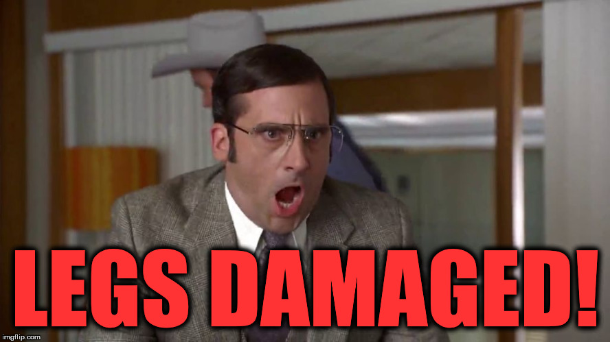
Post by bronzeknee on Aug 11, 2017 12:50:40 GMT -5
There is nothing worse in the new UI than:
LEGS DAMAGED!
It's way too big on the screen, and when you are getting nailed you'll see it several times, annoyingly.
|
|
|
|
Post by Poopface on Aug 11, 2017 13:15:56 GMT -5
|
|
|
|
Post by Danny Linguini on Aug 11, 2017 13:31:43 GMT -5
You have some growth to achieve as a pilot if you find no use for the news feed.It's important, and its current placement is obnoxious to say the least. With no explanation as to why it's ne necessary I find this kind of insulting and dismissive. I know I'm not a very good player and I'm not interested in confrontation, so I'll try to avoid commenting too much in the future. I was just trying to participate. Sorry. Don't take offense. I think all he means is there is some valuable info in that message stream once you get used to looking for it. For example, I like to know who just killed me or a teammate and with what weapon. While my memory is basically 「dookie」, I do retain a few minor details for short periods of time, and knowing what bots are wandering around with what weapons without having actually seen them can help me decide which bot to drop next, especially if it's in close proximity to spawn area. And so I can hunt them down for retribution, dammit. I'm sure there's more from other players, but that's just a bit of what I get out of it. As for its placement, having played it on the TS, I think it will just be a matter of getting used to its new location in the display. |
|
|
|
Post by drake1588 on Aug 11, 2017 13:31:49 GMT -5
Mostly agree with you. I'm trying to reserve judgment on the new UI - it's much, much worse on release, but I also see how it could be very good if they allow us to simply unlock, move, and resize the components, and allow us to have some choices about how nameplates are displayed. As it is, I have had dozens of encounters where I could not even see my target that was 200m away because it was completely covered by nameplates. I couldn't tell if it was behind cover or not. Once we have the option to customize it for our specific phone or tablet, I could see it being an awesome change.
|
|
|
|
Post by T34 on Aug 11, 2017 19:39:20 GMT -5
With no explanation as to why it's ne necessary I find this kind of insulting and dismissive. I know I'm not a very good player and I'm not interested in confrontation, so I'll try to avoid commenting too much in the future. I was just trying to participate. Sorry. Thunderkiss's comment may have come across as abrasive but that is not reason to comment less. Regarding the kill log, it may be important to you, it may not be. Some people rely on it to plan their next play, in terms of whom to seek/avoid, or what is the prevalence of certain weapon types on the map at the moment. And for that, it is important. If you have a good visual memory, or have little/no need for the information described above, then more power to you. The kill log is a helpful aid but you not using it does not make you a bad player. There is always room for improvement. Two other benefits to the kill log 1. When and if your name comes up first and 5 times in a row than it's time for a screen shot and a giggle 2. Good to know who got the kill during events when on the kill task |
|